- Solution
Services for You

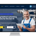
Australia’s Choice for Technical SEO & Digital Marketing
Australia
Oran Park, New South Wales, 2570, Australia.-
 Send Us Mail
 -
 Call 24/7 Hours
0433 695 579
- Industry: Home & Lifestyle
- Solution: Digital Marketing
- Clients: --
- Date: 05/22/2025
Projects Summary
Client Needs:
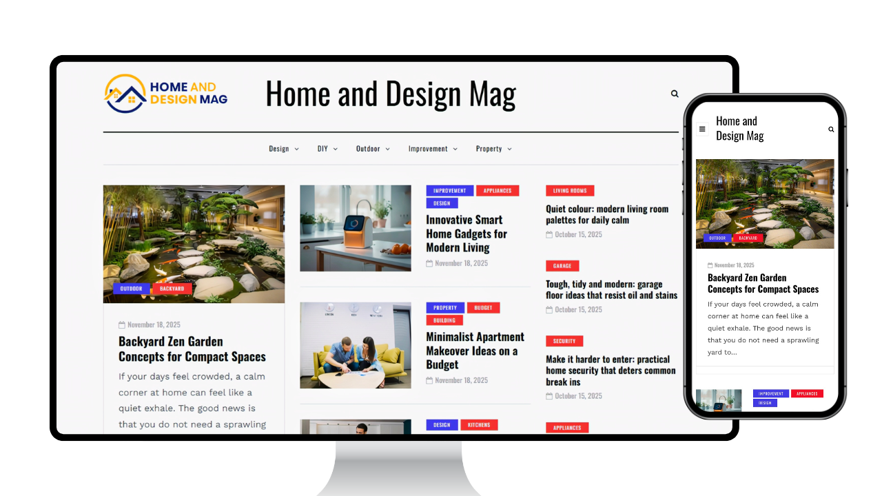
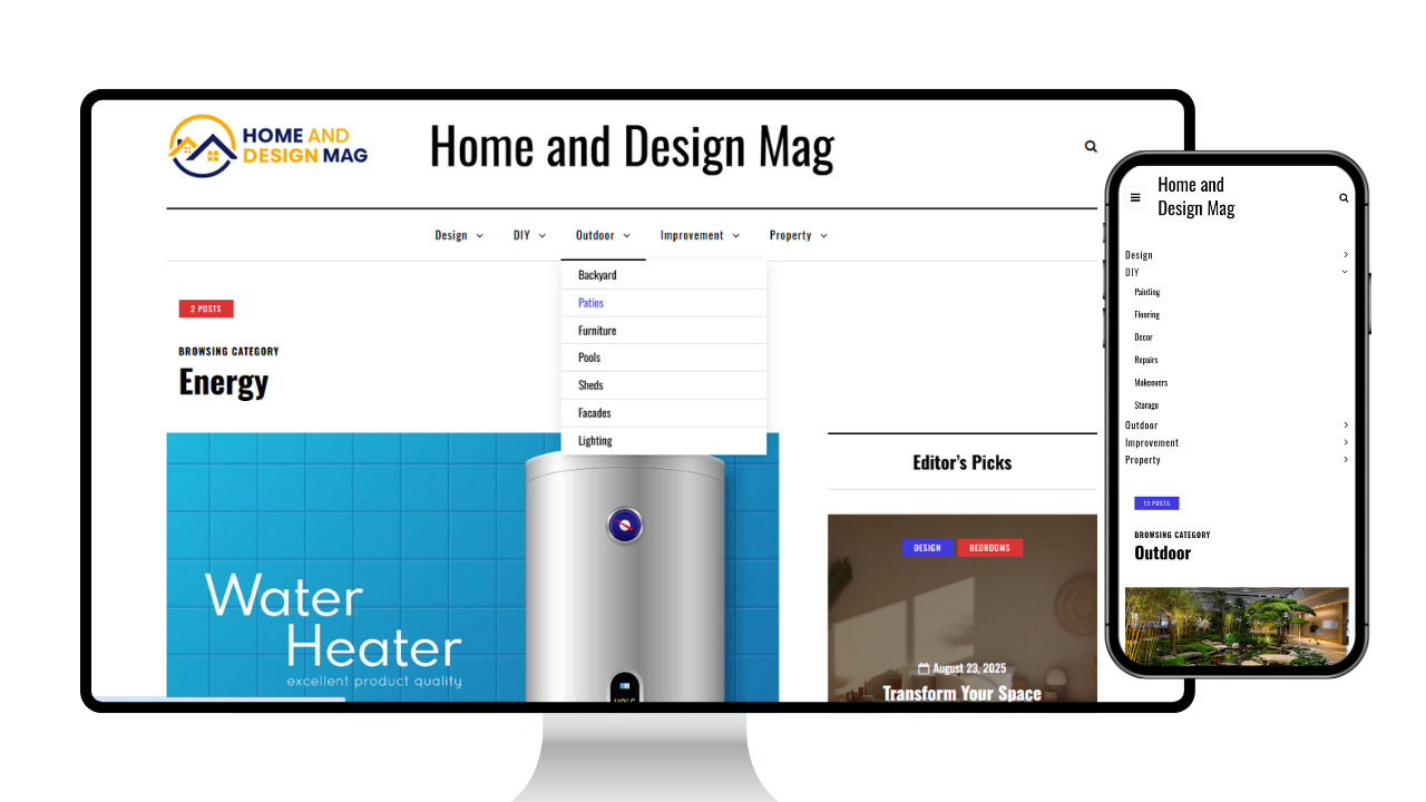
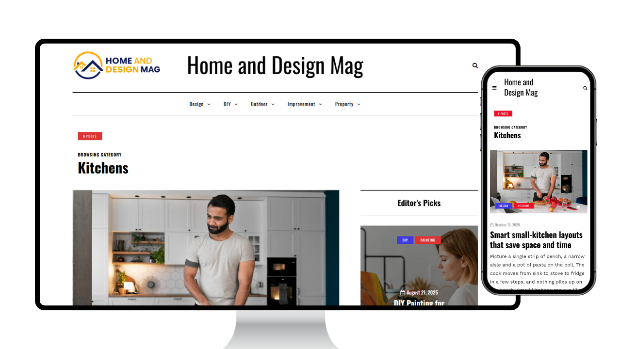
Home & Design Mag needed a modern editorial website that felt premium, easy to browse, and built for content discovery. The goal was to present a large volume of articles across multiple categories while keeping the reading experience clean and distraction-free. They wanted a structure that highlights trending stories, supports evergreen content, and encourages deeper browsing through better navigation, featured sections, and strong internal linking without overwhelming the user.
Service Provide
Comprehensive website, branding and content solution for Premier Care Connect.
- Web Development
- UI/UX Design
- Digital Marketing
- Video & Content Production
Our Approach:
We started by mapping the site like a digital magazine home page hierarchy, category layouts, and article templates designed for fast scanning and comfortable reading. We created a consistent visual system (spacing, typography, and card styles) so every section feels cohesive even as content grows. The build focused on discoverability: clear category paths, related content placement, and structured templates.
Challenges
The main challenge was balancing an elegant magazine feel with usability at scale. With frequent updates and multiple categories, the design needed to remain consistent while allowing flexibility for different post types and featured content. We also had to ensure the site stays fast and readable across devices, keeping images and layouts optimized while maintaining a premium editorial look.
Results / Success Metrics
A clean editorial layout that improves readability and helps users discover more content through clear categories and internal navigation.
- Better content discoverability
- Improved reading experience on mobile and desktop
- Clear trust pages
- Stronger contact visibility
- Fast and Smooth
The layout makes articles easier to read and helps visitors move naturally from one topic to the next. The site feels clean, organized, and fast to browse.
--